Case Study: MKW Creative Co. for the San Diego Open Tennis Tournament
Imagine the vibrant scene of San Diego, alive with the energy of tennis enthusiasts and local businesses excited for the debut of the San Diego Open. In need of marketing support, this collaborative project began in 2021 when we joined forces with Katharine LiMandri and Troy Morrison of Torrey Pines Marketing to craft event branding, social media strategy, signage, and on-site event activations for this prestigious men’s and women’s tennis tournament.
Now, three years later, we’re ready to share the thrilling tale of growth, innovation, and collaboration that marked our partnership with San Diego Open. Get ready to make a racquet as we unpack every design detail!
Year 1: Setting the Stage with the 2022 San Diego Open
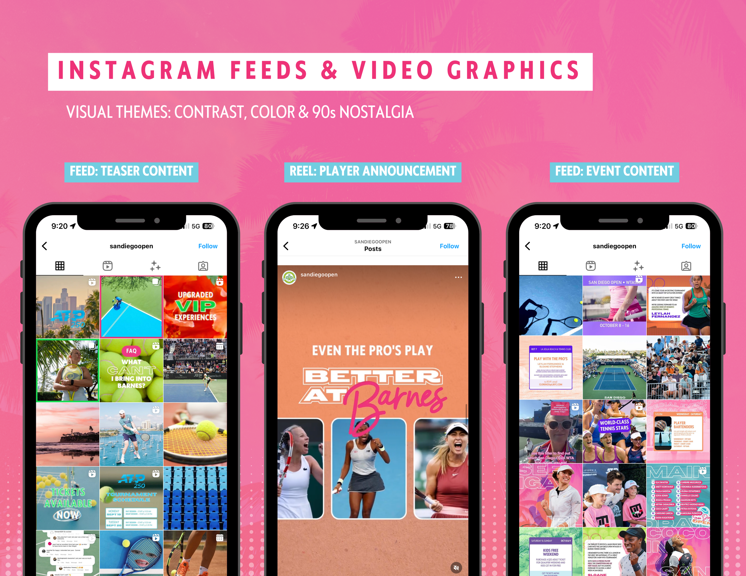
Our journey kicked off as we dove headfirst into the vibrant world of San Diego Open. With Katharine by our side, we set out to create a visual identity that screamed San Diego from every angle. Think 90s influences, bright colors, bold designs, and an unmistakable sense of coastal charm.
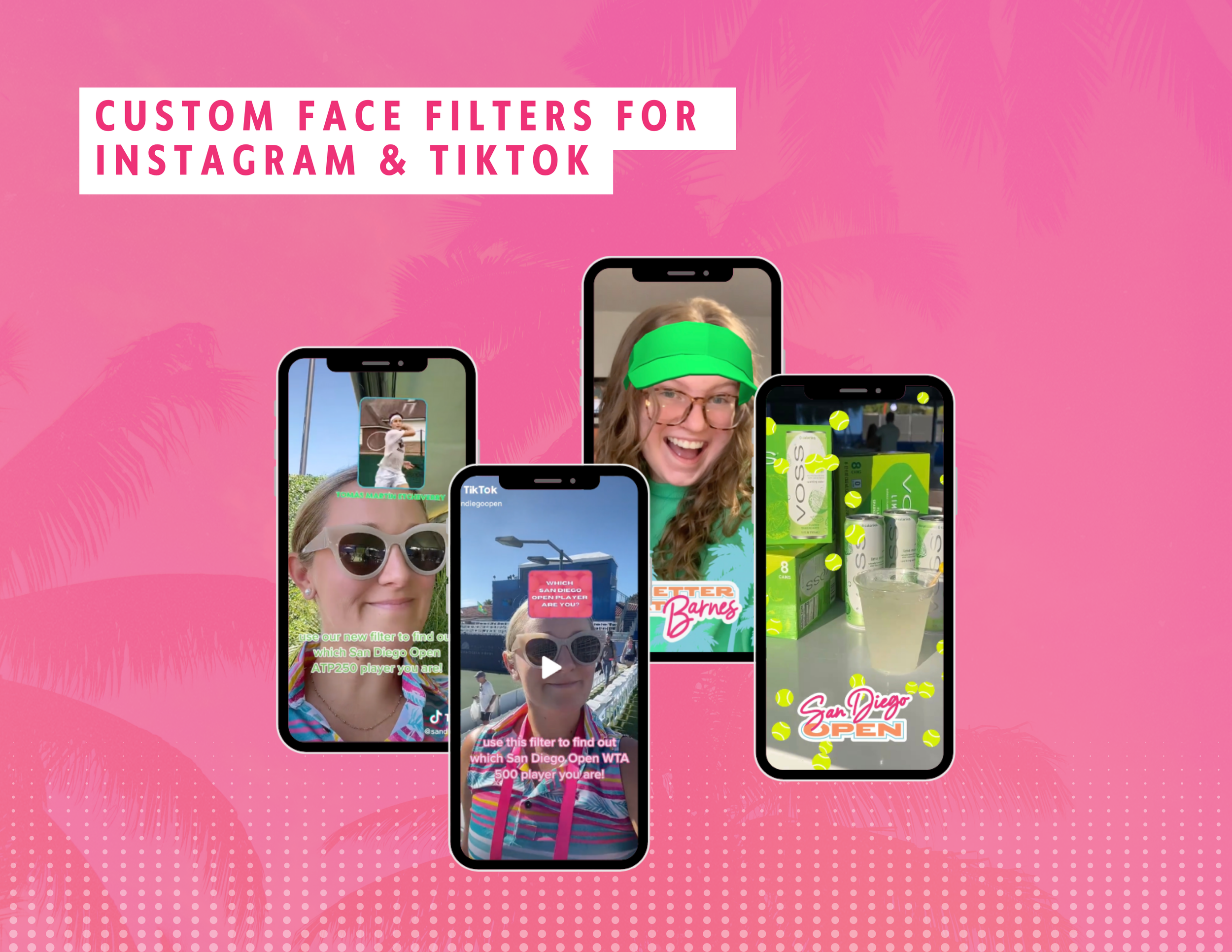
With the vision firmly in place, it was all hands on deck as we brought the brand to life across every platform imaginable. Our team created all the print, digital, and social media assets to promote the 9-day ATP250 tournament from September 17-25, 2022, and the 9-day WTA500 tournament from October 8-16, 2022. From eye-catching print materials to engaging digital assets to captivating social media content, our goal was simple: make San Diego Open the talk of the town. And boy, did we deliver.
WHAT WE DID
BRANDING & CREATIVE DIRECTION
Full branding identity, including logos, color suite, font suit, and supporting illustrations
Print & banner design
Custom merch designs
SOCIAL MEDIA MARKETING
At this time, San Diego Open was undoubtedly one of the biggest projects my team had ever worked on. From branding to social and on-site content creation over the course of two tournaments, it flexed our creative muscles. You can learn more about the behind-the-scenes strategy, planning, and execution of all things 2022 San Diego Open by tuning into the Kiss My Aesthetic podcast Ep. 96 Client Case Study San Diego Open with Katharine LiMandri wherever you get your podcasts.
Year 2: Building Momentum with Cymbiotika for the 2023 San Diego Open
We were ready to kick things up a notch as year two approached. Enter presenting sponsor Cymbiotika, who brought a fresh wave of energy and inspiration to the table. With their support, we set out to reinvent the San Diego Open experience and take it to new heights.
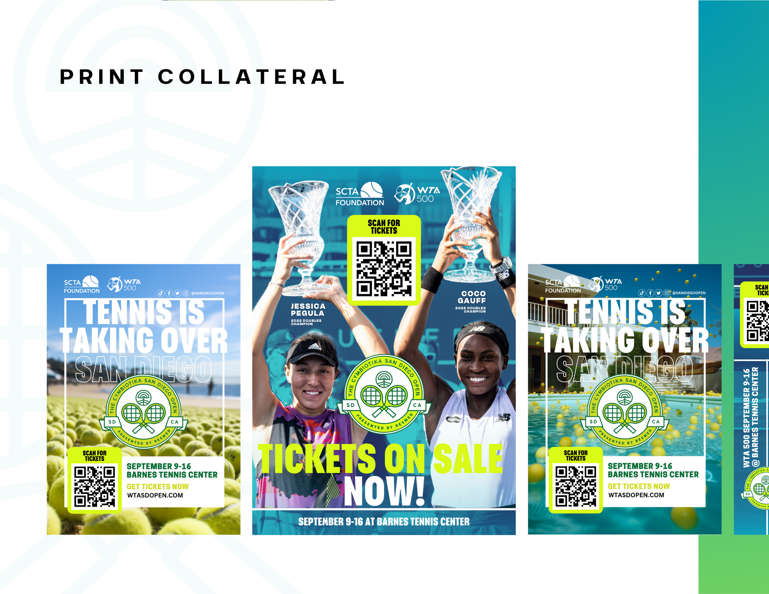
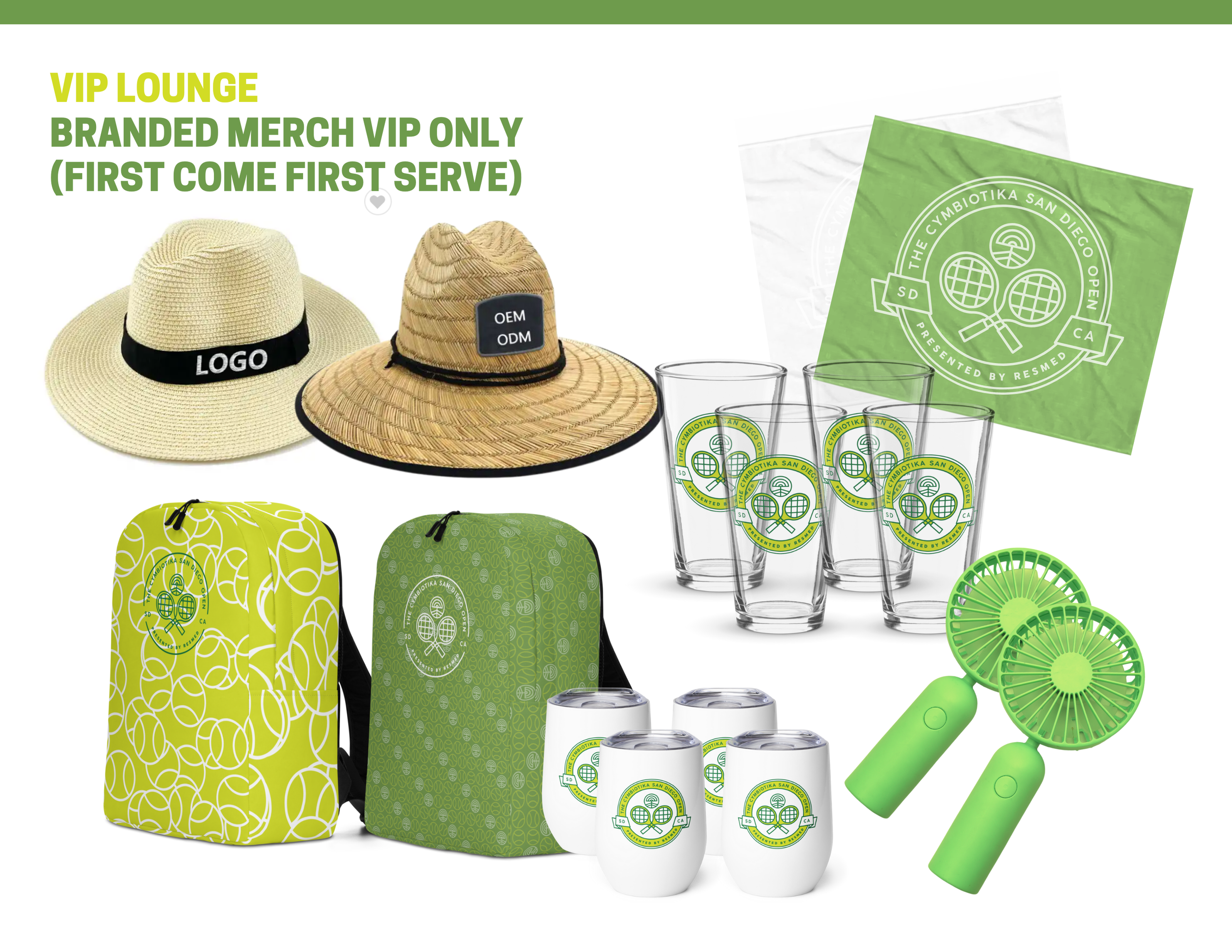
Drawing inspiration from Cymbiotika's serene aesthetics and the vibrant spirit of San Diego, we embark on a creative journey unlike any other. From sleek event signage to dynamic digital marketing materials, every aspect of the brand got a makeover with updated logos, colors, fonts, styles, signage, banners, videos, merch, social media, and more for the 6-day WTA500 tournament from September 11-16, 2023, elevating the tennis aesthetic to be on par with a Wimbledon or US Open (shoot high, right?).
WHAT WE DID
REBRANDING & CREATIVE DIRECTION
Full branding identity, including logos, color suite, font suit, and supporting illustrations
Print & banner design
Custom merch designs
VIP BRAND ACTIVATIONS
SOCIAL MEDIA MARKETING
From rebranding a past portfolio project to welcoming AI technology in our design process, the 2023 San Diego Open project was one for the books. You can learn more about the behind-the-scenes strategy, planning, and execution of all things 2023 San Diego Open by tuning into the Kiss My Aesthetic podcast Ep. 126 2023 Cymbiotika San Diego Open with Ryan Redondo wherever you get your podcasts.
YEAR 3: Meme Marketing was the MVP of the 2024 San Diego Open
In year 3, our 2022 rebrand identity was still in play, and we entered the project with aesthetic consistency. However, we faced a Herculean task: to elevate San Diego Open’s marketing prowess with an extremely limited budget and tight turnaround. With ingenuity as our compass, we crafted a marketing campaign that defied expectations and set pulses racing through meme marketing, using quick, trend-responsive content and AI graphics.
Leveraging the power of meme marketing, our “Tennis is for Lovers” campaign took our social community by storm, transforming ordinary tennis balls into Valentine’s Day or love-related motifs. From viral memes to witty captions, each post was a hit, drawing fans into the San Diego Open's orbit.
WHAT WE DID
DESIGN & CREATIVE DIRECTION
Print & digital flier design
SOCIAL MEDIA MARKETING
Off-court Conclusion
And there you have it: the dynamic eras of San Diego Open. From setting the stage with a bold visual identity to building momentum with strategic partnerships and innovative activations, our journey with San Diego Open is a testament to the power of collaboration, creativity, and community. As we look ahead, we're excited to continue pushing boundaries, breaking new ground, and creating unforgettable experiences for our clients and their audiences! Which tennis era was your favorite? Let us know in the comments!
New to MKWCC?
MKW Creative Co. started back in 2014 with not much more than a laptop and two very encouraging parents saying, “hey, try it!” Since then, the business has taken many shapes and forms, but the vision and dream have always stayed true — helping build brag-worthy brands that people are proud to be a part of and founders are proud to share with the world.


