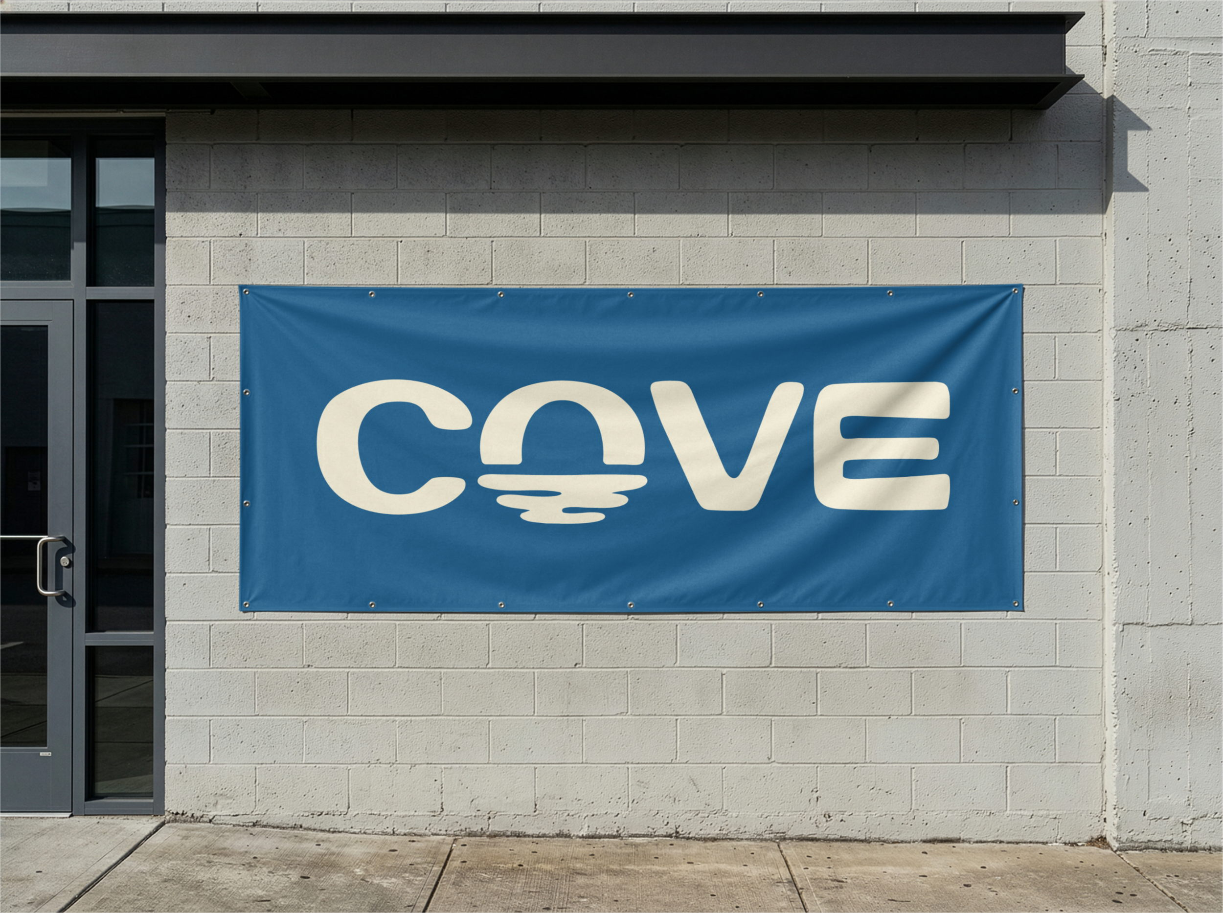
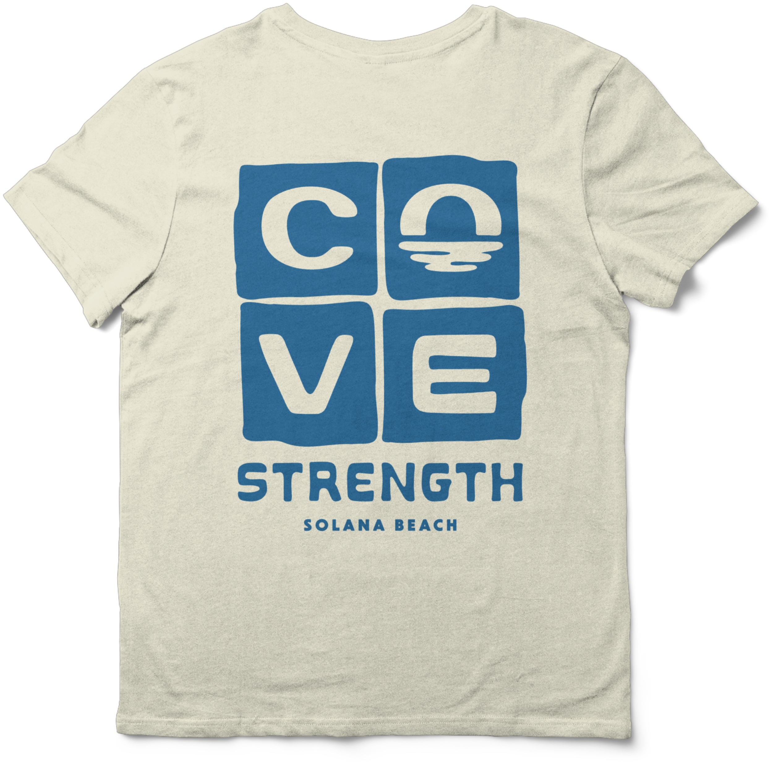
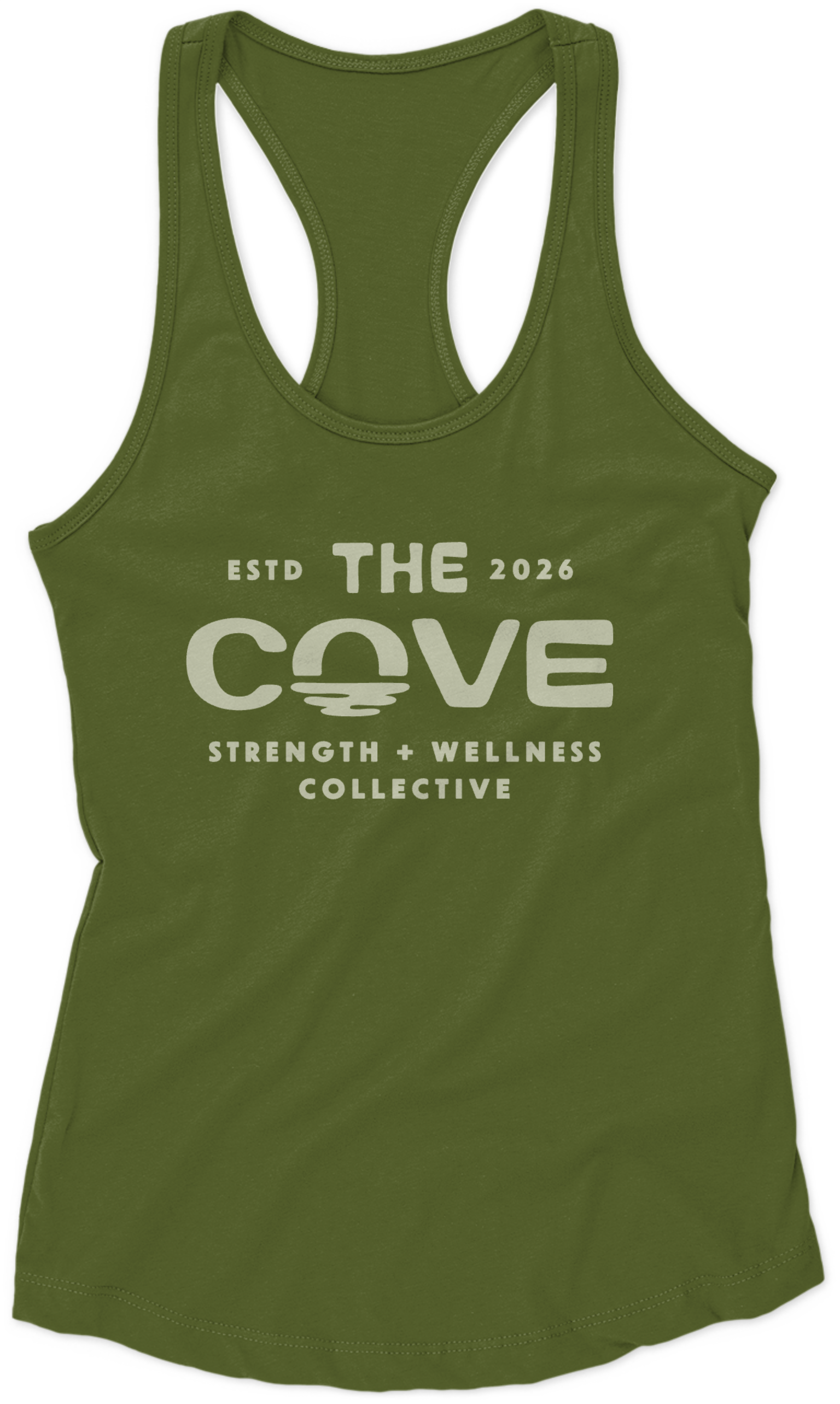
Cove Strength & Wellness · Solana Beach, CA
HOW IT STARTED
The project began with a rebrand from an existing identity that wasn't quite working — the old logo and name were described as too abstract, hard to say, hard to pronounce, and hard to remember. It also felt disconnected from the actual service being offered. Eric wanted something that better reflected the sense of place, the community, the strength training focus, and the more holistic offerings like breath work and meditation — while striking a balance between masculine and feminine energy that the previous mark was missing.
WHAT WE DESIGNED
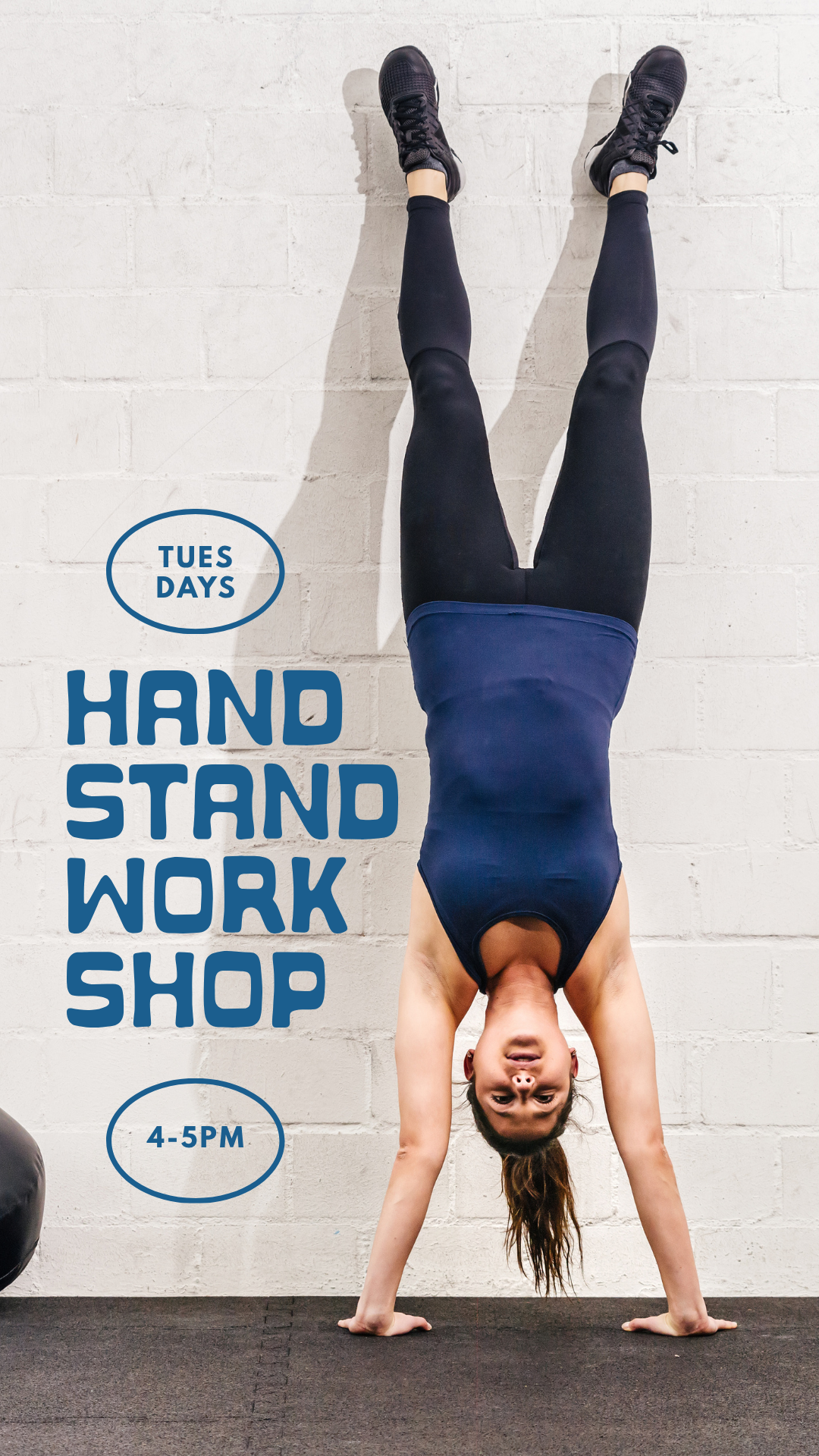
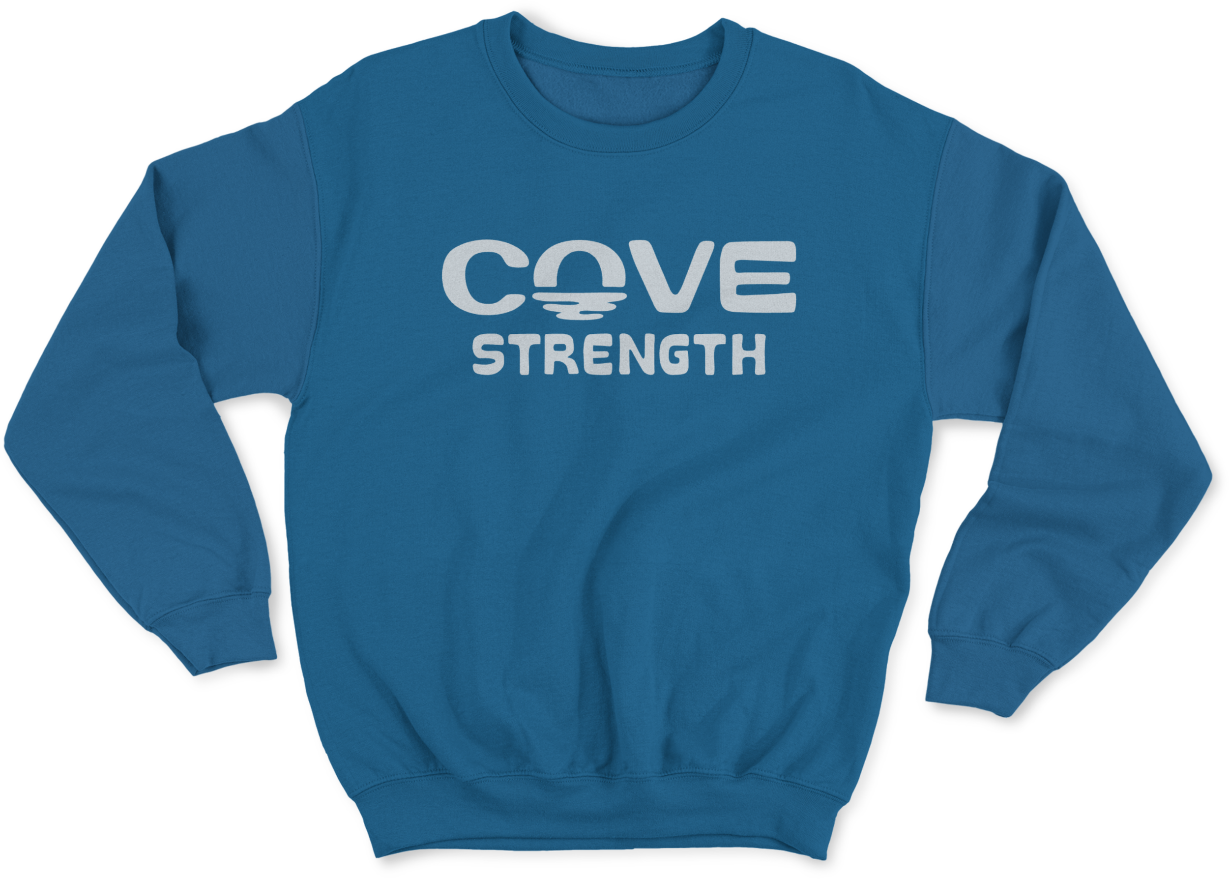
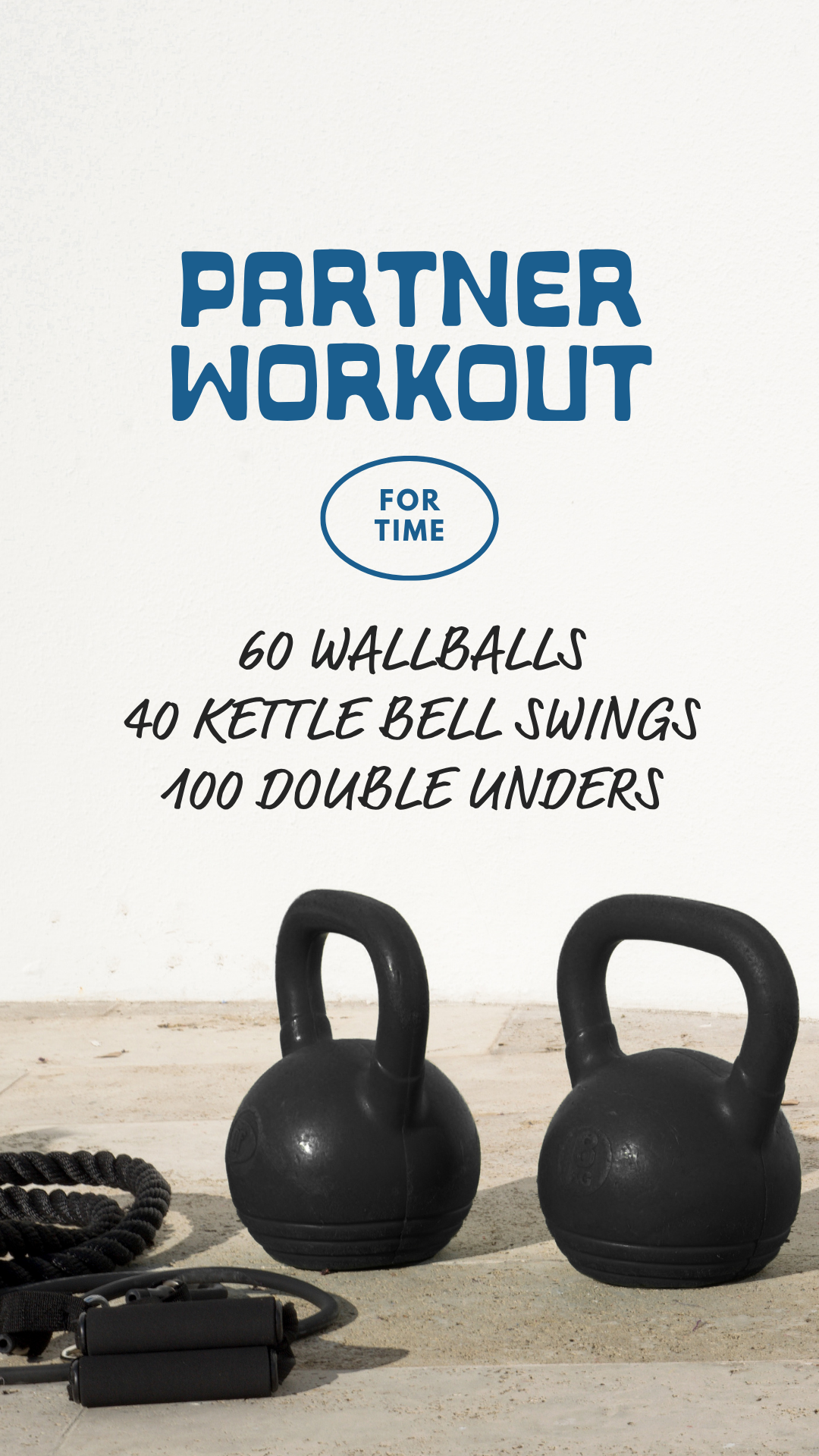
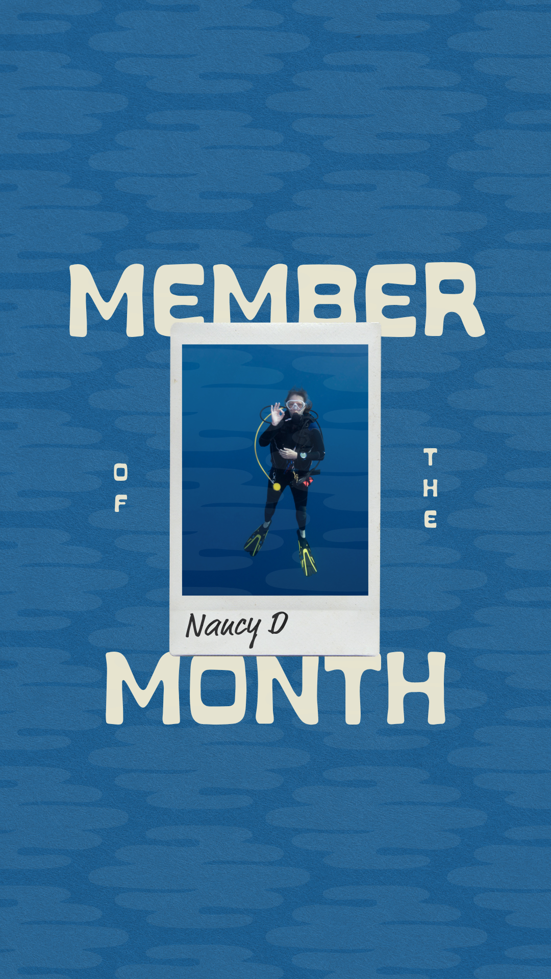
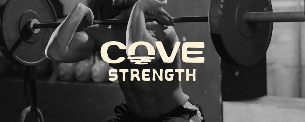
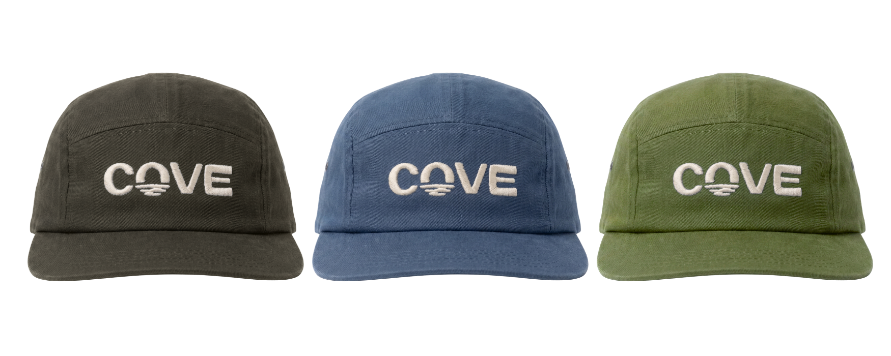
We designed a warm, coastal lifestyle brand identity for Cove Strength that balances approachable energy with genuine strength — rooted in the North County San Diego community it serves. The project included a custom wordmark using a locally-designed organic font, a signature icon built from the O in "Cove" that reads as a sunset, water ripples, and a kettlebell simultaneously, and a flexible logo suite adaptable across the business's evolving offerings. The color palette expanded on the existing blue with natural tans, greens, and warm neutrals to evoke coastal California without leaning too tropical. We also developed brand typography, photography direction, social media concepts, and a merch system designed to grow into a true lifestyle brand. The result is a distinctive, versatile identity that feels established, wearable, and unmistakably North County.